
Explore how purposeful emptiness amplifies emotion, narrative, and focus in your images. Chosen theme: Utilizing Negative Space for Impactful Photography. Read, try the exercises, and share your results—or subscribe for weekly space-focused challenges and insights.
Train Your Eye to See the Invisible
When the frame feels quiet, the subject grows louder. Let the sky be a poem, the wall a pause, and the corridor a sigh. Notice how attention shifts, and describe one moment when emptiness sharpened your story.
Train Your Eye to See the Invisible
Find a single subject—mug, leaf, or person—against a clean background. Step back. Leave generous space around it. Shoot three angles. Compare how your feelings change with extra breathing room. Share your favorite result in the comments and explain why.
Train Your Eye to See the Invisible
After each session, list what you excluded: signs, wires, extra faces, or busy textures. This habit clarifies intent and strengthens composition. Post one insight from your journal below to help other readers refine their vision too.
Compositional Building Blocks for Spacious Frames
Place the subject on a third, then give it space to ‘look’ or ‘move’ into. That open area becomes narrative fuel, hinting at possibility or distance. Try both left and right weightings and tell us which side feels more expressive.
Compositional Building Blocks for Spacious Frames
Asymmetry plus negative space creates dynamic equilibrium. A small, dark figure against a large pale field feels dramatic. Adjust framing until the emptiness feels intentional, not accidental. Share a before-and-after crop showing how balance changed your shot.
High-Key vs. Low-Key Space
High-key space (bright, airy tones) whispers optimism; low-key space (deep, velvety shadows) murmurs solitude and drama. Expose for intent, not default correctness. Post two versions of the same scene—one bright, one dark—and ask followers which story resonates.
Color Minimalism that Guides Emotion
Limit the palette: pale blues for calm, muted earth for groundedness, stark monochrome for clarity. A single accent color in a field of neutrals becomes a beacon. Invite readers to suggest color pairings and test them on your next walk.
Texture: Smooth, Grainy, and In-Between
A foggy bay erases detail, while a concrete wall adds quiet grit. Texture modulates how ‘present’ your space feels. Try haze, fabric backdrops, or long exposures. Share one unexpected material you used to craft beautiful emptiness.
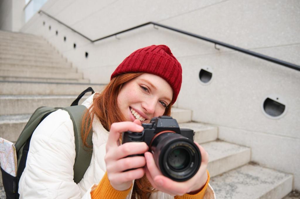
Across Genres: Portraits, Street, and Landscapes
Position your subject off-center and let neutral background areas cradle their expression. Soft walls, blank curtains, or sky-lit windows amplify emotion without clutter. Tag a portrait where the space mirrors the sitter’s mood and explain your placement.
Across Genres: Portraits, Street, and Landscapes
Wait for a lone passerby against a bright billboard or empty facade. The gap around them becomes narrative: isolation, purpose, or humor. Channel Fan Ho’s elegance—timing plus geometry. Share your favorite corner for spacious street scenes.
On-Location Techniques That Keep Space Clean
Long lenses compress distractions and isolate subjects against uniform backgrounds; wide lenses exaggerate space and scale. Move your feet before swapping glass. Report which focal length gave you the cleanest backdrop for today’s practice.
Editing with Intentional Emptiness
Crop with Courage and Purpose
Trim distractions at the edges and commit to bold negative space. A tighter or wider crop can reveal the story you felt on location. Share two crops and ask readers which communicates your intent more clearly—and why.
Shape Light: Dodge, Burn, and Guide
Gently burn busy corners and dodge the subject’s face to create an elegant gradient. Subtlety preserves realism while steering attention. Post your before-and-after histogram and note how the tonal map supports your empty areas.
When to Go Monochrome
Black and white can unify cluttered colors and elevate shape. If hue distracts from space, convert thoughtfully. Add slight grain for mood or clarity for modern polish. Invite peers to vote on color versus mono in your latest shot.
Story, Anecdote, and a Community Challenge
A Beach at Dusk: The One That Clicked
I framed a solitary gull against a pale horizon, leaving two-thirds sky. The moment felt weightless. Later, a viewer wrote it calmed their day. Have you had a similar response to your negative-space images? Tell us the story.
Common Pitfalls and How to Fix Them
Clutter at the edges, unintentional mergers, and space that feels accidental. Step back, simplify, or shift your angle. Ask a friend what they notice first. Comment with one pitfall you’ll avoid this week and your plan.
Join the Weekly #NegativeSpaceChallenge
This week, feature a small subject in a big, calm environment—no more than three colors, plenty of breathing room. Post, tag #NegativeSpaceChallenge, and invite feedback. Subscribe for next week’s prompt and curated highlights from the community.